A unique brand for a unique target audience

The challenge
“Burning” or “re-branding” a service that isn't necessarily unique always comes with challenges. So why did we choose to take on this assignment? In one of the first conversations, it soon became clear that Flow&Co (formerly Admin Solutions) wants to appeal to a very specific and unique target group: young artists, creatives, producers and artists.
The challenge: How do we make a service like “administration and advice” attractive and relevant for such a creative target group?
Getting started
The concept
Admin Solutions was the original company name, but it didn't sound particularly appealing to a creative target group. So the question was: how can we come up with a name that better matches the brand we want to create for this target group?
After an extensive brainstorming session and searching through countless available domain names, the perfect name was finally created: Flow&Co.

The name change. How did we get it?
We quickly came up with the word Flow. For many creatives, our overarching target group, this is a familiar term. Flow refers to that optimal state where you are fully immersed in your work and can be creative and productive. Creatives continuously strive for this flow state, but they often only achieve it if they are free from distractions. So how frustrating is it when your mind keeps wandering to unpaid blue letters or that sales tax yet-to-be filled?
“Flow is that mental state where you are completely immersed in your work, without distractions, so you are at your most creative and productive.”
A new name calls for a powerful pay-off
The name alone doesn't tell the full story. It was supposed to clarify exactly what the company does. This is how the pay-off quickly came about: Admin for tomorrow's creators (“Makers” is a collective term that stands for artists, artists, creatives and producers - the core of our target group).

Corporate identity development
With the new name and a sharply defined niche, it was clear that a standard, boring administration style would not do. Fortunately, the word offered Flow plenty of creative opportunities.
Based on the concept Flow we designed two different stylescapes that we presented to the customer. Both responded to the core values and brand associations, each with a unique perspective. In the end, the customer opted for the blue-orange style, which we From/To have mentioned.

When further developing the chosen style scape, we came up with a unique shape that perfectly reflects the flow state of the creative person in a simple way. Using this symbol, the style was created and you can discover the shape in various shapes and sizes, such as: picture frames, patterns and even in the logo.
Marketing and corporate identity
It soon became clear that flyers are still regularly used at locations such as Herman Brood College, where the target group is active. A flyer thus became an essential part of the corporate identity. Together with the flyer, we developed a series of social media posts and our own business card, especially for more traditional customers and possible partners.

Design and development of the Webflow website
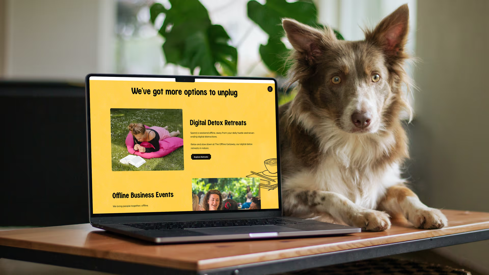
With the new style in the pocket, it was time to develop the Webflow website. We created a compelling one-pager focused on the essence of the brand: liberating creatives and letting them be free. Since the target group cannot dive into detail on a one-pager, the website had to be direct and convincing.

Using the Storybrand method, we created an effective flow in the website by responding to the needs and problems of the target group.
Conclusion
The project for Flow&Co illustrates our strength in creating a brand that not only meets the unique needs of a creative target group, but also offers a strong visual identity and online presence. By combining strategic branding with thoughtful design choices and effective marketing expressions, we have laid a solid foundation for Flow&Co to grow and thrive in a competitive market. We are proud of the result and look forward to further supporting their journey.
A positive customer review


Martijn Pulles
Flow&Co
Results achieved


