Further than ever through a rebranding

The challenge
Mobiliteitsbaas is a leading brand that focuses on innovative solutions for mobility issues. Despite their progressive approach, communication to their diverse target groups became increasingly difficult, there was no overarching marketing message that tackled all target groups, and this created an incoherent brand image. To solve this problem, we organized two creative sessions where, together with the Mobiliteitsbaas team, we redefined the brand and thoroughly analyzed the target groups. This resulted in a repositioning that formed a basis for a complete re-branding that allows the brand to communicate clearly again and re-express what it wants to convey.
Getting started
Reposition and re-brand!
In collaboration with the customer, we organized two creative sessions to thoroughly analyze the issues of the brand, identity and target groups. During these sessions, we used tools such as the Brand Identity Canvas, the Archetype System, and the StoryBrand Canvas to redefine the brand identity and message. The result was a clear repositioning that formed the basis for a complete re-brand. This approach enables the brand to communicate consistently and purposefully again, and to re-express what it wants to convey.

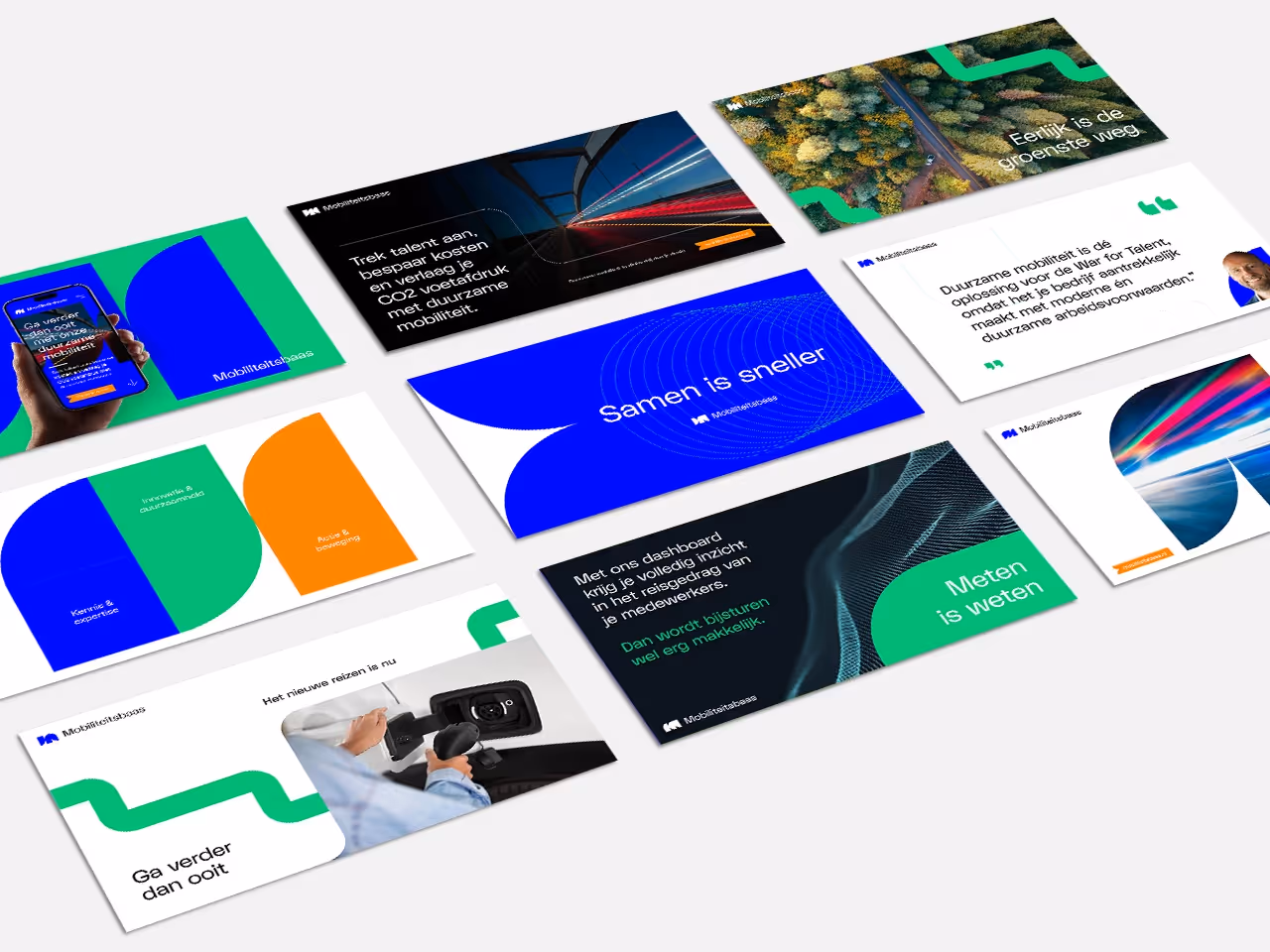
The visual identity
With the completed canvases as a solid basis, we continued with the design. A new visual style had to be developed that was more in line with the brand and more clearly exuded innovation and sustainability. A brainstorming session gave birth to the idea for the green road — a metaphor for the journey that Mobiliteitsbaas and his customers take to a future-proof and sustainable world. The greenway consists of two elements: a straight section and a curve. These simple basic shapes offered endless creative possibilities for using color frames, buttons, CTAs, photo frames, and even the logo. The green way is not only a visual element, but also a symbol of cooperation and the joint journey towards a sustainable future that Mobiliteitsbaas is taking on with its customers.
New images for a new brand
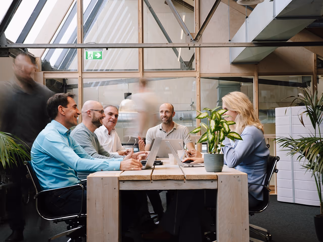
Together with Sander Karsen, we shot great new images for the brand at Mobiliteitsbaas' office. These images are mainly used to put the team and the collaboration in the spotlight. In addition, we played to get elements of movement and speed into the photo by playing with the shutter speed.
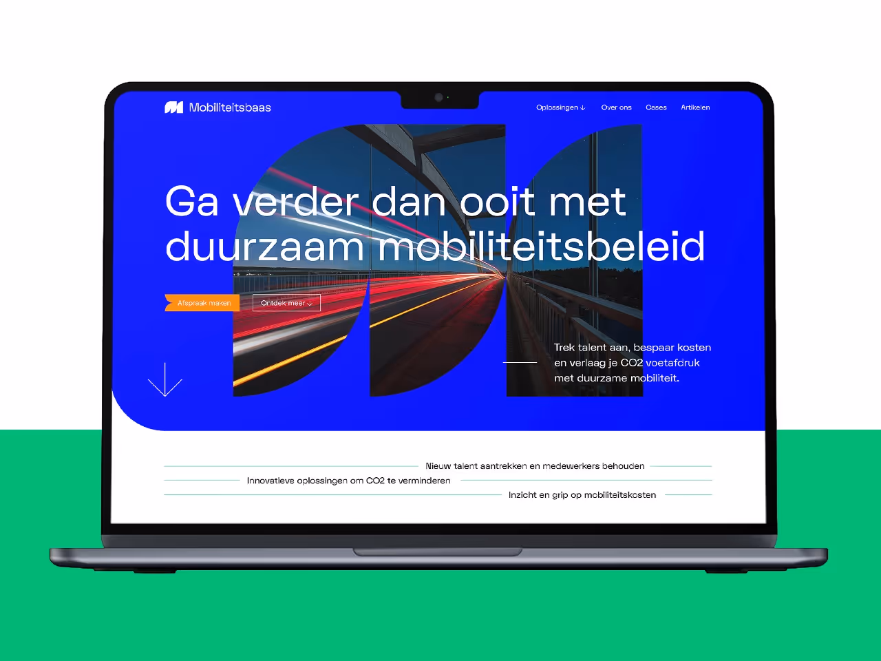
Webflow Website Design and Development
Our process started with detailed wireframes, optimizing the user experience by strategically focusing on navigation structure, user flow, and the balanced placement of content and visual elements. This approach ensured that we were able to lay a solid foundation, ready for the next phase: the mock-ups.
During the mock-up phase, the new visual style came to life for the first time. In addition to the homepage, we designed three additional pages to give the customer a complete picture of the renewed website. After a successful presentation, we got the green light and immediately started developing in Webflow.
With the client-first system within Webflow, we developed a website that scales perfectly on any device, while giving us the creative freedom to design in detail. The end result? A visually appealing and functional website that not only generates leads, but also seamlessly matches Mobiliteitsbaas' mission and goals.
A positive customer review

Bart Meijs
Mobiliteitsbaas
Results achieved


